Multi-vendor Collaboration
Quancious | e-Commerce | India
Responsive web prototype + Design
Home / Success Stories / Quancious
UX-UI delivery in a multi-vendor collaboration environment, ensuring brand consistency while managing different stakeholder expectations
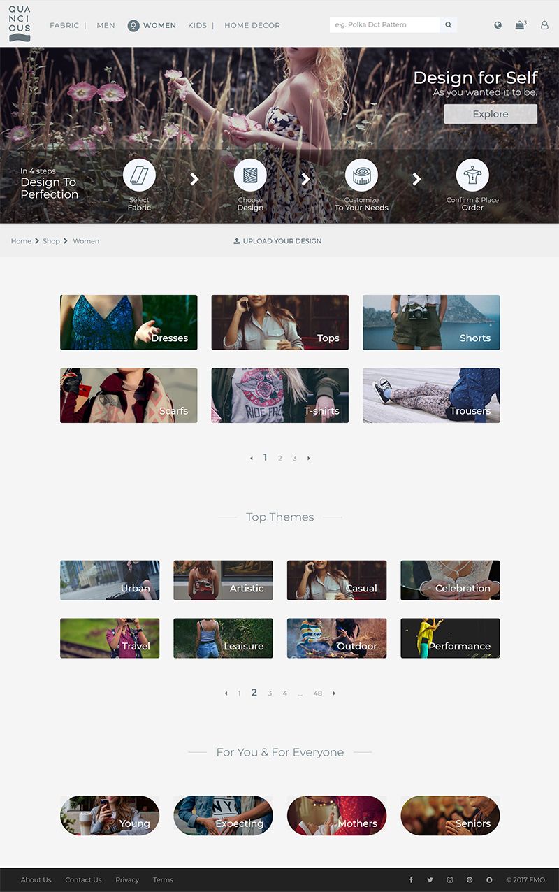
Quancious, a notable player in the apparel industry, came up with the visionary idea of launching an e-commerce portal where consumers could customise and order fabric, clothing and home furnishing products online. UIConnect crafted a UX with relevant design, brand and tech requirements to make the dream real.
- Visualisation of a business idea
- Responsive HTML pages for ease of back-end integration
- Collaboration with branding and tech teams
Background
Can we build a business out of making clothes for customers, designed by the customers themselves? Can we give people the power to pick their own style? Back in 2017, for Quancious, the answer to both these questions was a definite ‘yes.’ It was a new-age effort at making clothing fully customisable for discerning buyers.
The ambition was lofty but worth the hard work. It was all about providing custom-design possibility - every imaginable pattern and colour to suit a variety of body types, heights and sizes. That sounded like a mind-boggling proposition, even before one thought of production, packaging, and delivery. Someone would have to help with the tech-stack while the in-house creative agency worked on the brand story.
The development on the web of a complex product that involved offering multiple options at several stages with seemingly unlimited combinations required a deep level of expertise and hands-on experience in UX and front-end development. It could not be done in isolation. One had to have a good grip on the back-end technology and complexity of integration. At this rather sweet spot, the tech team's implementation partner invited UIConnect to propose approaches and develop UX solutions for this innovative e-commerce website.
What is Quancious?
- Quancious is an e-commerce website that offers apparel customisation in the men’s shirt, womenswear and home decor categories. With eight different types of fabric and five more in the pipeline, including interesting choices such as bamboo linen, the prints and opportunities are endless.
- Customers choose their clothing pattern, fabric and design before moving on to embellishments such as borders and buttons. From a technological perspective, customisation means that multiple aspects of a single piece of clothing need options, beginning from the time a fabric is chosen till the final embellishments are in place.
- Customers then choose their product size, with an option to choose height as well for greater sizing accuracy.
- Finally, the customer proceeds to checkout and payment.
Key Challenges
- The portal had to be on IBM's proprietary e-commerce platform, which meant a steep learning curve and implementation issues with UX, especially within the tool’s architecture and framework.
- Some custom but breakthrough UX features, supposed to help in simplifying a user’s journey, were not readily available in the e-commerce tool and had to be thought through to be integrated backwards.
- The final UX design solution needed to be responsive in multiple resolutions across mobile, tablet and desktop.
- Implementation hurdles for web media had to be pre-empted.
Our Solution
With a fixed deadline for the launch, the minutes were ticking from the very first day. While the UX requirement was being captured, the branding team progressed with brand architecture and identity guidelines. As all the departments were interdependent and none of them could be halted, a collaborative solution was needed to bring the brand, tech, management and UX teams onto a single page. It was essential that the management team of Quancious, the e-commerce platform team at IBM, the tech implementation partner Solveda and the third-party branding agency were all perfectly aligned.

Our Approach
We organised a three-day on-site project-kick-off workshop with the client at the company’s production facility/office. First, we made sure we understood the business process, technology implementation approach, the brand’s essence, and the design guidelines. Then we adopted a 'prototype first before development' approach.
- A low-fidelity prototype (wireframes/blueprint) was built to help all the stakeholders visualise the user journey and e-commerce process flow from catalogue to checkout.
- The low-fidelity prototype was then converted into a high-fidelity version that fleshed out product specifics, branding features and functioning, but was also scalable enough to implement brand guidelines and allow integration with the tech stack.
- Brand and visual identity guidelines were implemented.
- Multiple on-site and off-site discussion calls and meetings were set up with all stakeholders to keep them updated on work progress and ensuing action items.
- We constantly coordinated with the tech implementation partner to align our code delivery without gaps.
- Device-level responsiveness was fine-tuned and the code cleaned up before the final handover to the development team.